Samsung Galaxy Nexus Review
The Samsung Galaxy Nexus isn't just another Android phone, this is the standard by which all Ice Cream Sandwich phones will be judged. An example to every Android manufacturer out there, and every Android fan, this is the basic foundation of what you should expect in an Android smartphone. Is that setting the bar too high, though? The Samsung Galaxy Nexus is the third addition to Google's Nexus family, and second built by Samsung. It offers competitive specifications, innovative hardware, and it is the first phone to show off Google's brand new OS, Android 4.0. Can Google and Samsung make the best Android device in the world together? Is Android 4.0 just another dessert-themed mess? I break it down like Jet Li in Chinatown after the break.
Hardware/Design/Display
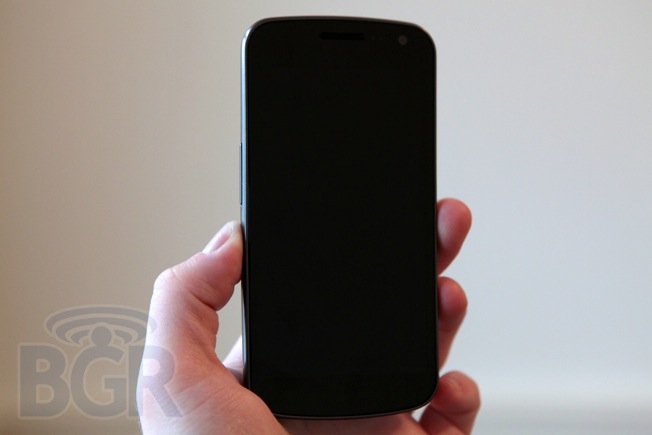
The Samsung Galaxy Nexus absolutely feels like the evolution of the Google Nexus family. In fact, the phone's identity is almost a perfect mashup of the original Nexus One and the Nexus S. It's flattened, a mix of black and medium gray, has a slight curved display, feels sturdy and strong, and even features the charging and syncing contact points that the original Nexus One touted.
While the phone's exterior is made entirely out of plastic, what seems like the only material Samsung will ever use in its smartphone cases, there's a metal chassis inside giving the device strength and a creak-free build. Looking at the Galaxy Nexus from an angle, you'll see a symmetrical curves that taper down to incredibly thin edges on the top and bottom. The phone follows these lines until around three quarters of the way down, then the infamous reverse chin rears its ugly head — the Galaxy Nexus is thinnest at the top and thickest at the bottom, much like the Samsung Nexus S or a giraffe.
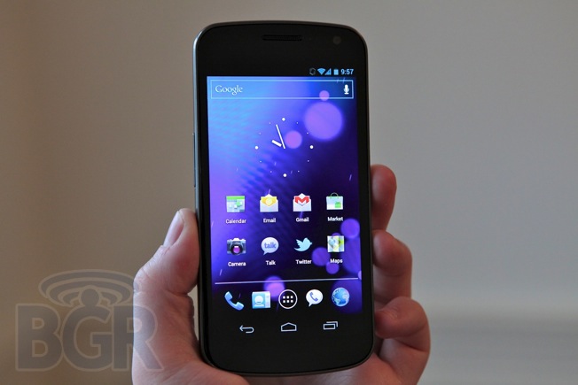
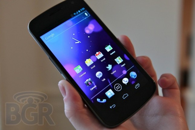
Google's latest reference handset introduces one of the first 720p HD displays ever to hit a smartphone, coming just after the HTC Rezound became the first smartphone in the United States with a 720p screen. In addition to the super high resolution 4.65-inch display, the Galaxy Nexus also features a 1.2GHz dual-core processor, 1GB of RAM, a 5-megapixel camera with no shutter lag, a 1.3-megapixel front-facing camera, 16GB of storage, Wi-Fi 802.11 a/b/g/n, Bluetooth 3.0, NFC and a 1,750 mAh battery.
While I'm used to carrying an iPhone 4S, I've also used countless larger displayed devices on and off for the last year or so, and even still, the display here is a bit too large for my liking. It's not the case of the bezel being too thick like on the Motorola DROID RAZR — in fact, with the 720p resolution, the display is much taller and less wide than the DROID RAZR — but it's still impossible to comfortably use the phone with one hand without constantly repositioning it.
I'm not someone with small hands either, so I have no doubt that this device is simply too big to be used comfortably by a pretty large segment of the population. The phone's thin fram and nice tapered edges help the situation slightly, but its footprint is almost unforgivably large because of the massive display. My sweet spot for screen size is probably about 4-inches, and this is out of bounds to me. The Galaxy Nexus feels very well manufactured, but the plastic case and terrible, terrible cheap plastic battery cover really take away from a lot of the phone's hardware advantages. I'm used to precision laser-cut stainless steel and glass like the materials used on Apple's iPhone and HTC's unibody devices, so Samsung's plastics just can't cut it.
The personality the Galaxy Nexus has is quite interesting. The design of the front of the phone is incredibly symmetrical its face gives you a window into the app or experience you're engaging with. Especially with the navigational keys now being soft keys on the display rather than separate buttons beneath it, the phone itself just seems to melt away and serve up Android. In the past this might not have been that smart, but Android 4.0 is a huge step forward that I'll go into in more depth in a little bit.
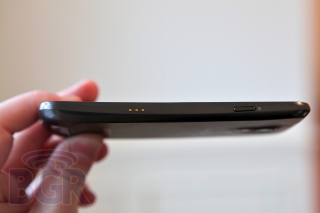
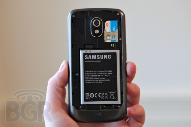
The power/unlock button is located on the right side with volume rocker key positioned on the left, and you'll find the phone's microUSB port and 3.5mm headset jack located on the bottom of the phone. Around back there is a second microphone for noise cancellation, the 5-megapixel camera, an LED flash and a speaker towards the bottom of the device.
While a 720p HD display might not make sense to some people, it's absolutely beautiful on the Galaxy Nexus. The 1280 x 720-pixel resolution on Samsung's 4.65-inch Super AMOLED screen is the most beautiful display I have seen on a mobile device besides the panel on the iPhone 4S. The whites are white, the blacks are black, and colors pop. The viewing angle is amazing, giving you superior viewing from any angle on the phone until it's practically turned around. The panel is extremely bright, though I was annoyed at how aggressive the auto-brightness worked in Android. In a dark setting it was fine, but in bright areas the screen was always too dim for my taste. Once I manually set the brightness, however, I was in love.
Android 4.0
Android 4.0 Ice Cream Sandwich finally bridges the gap between a tablet OS and smartphone OS, and it absolutely looks a marriage Honeycomb and Gingerbread, with a few dashes of TRON and Daft Punk. It's a much more cohesive OS and it's the first release from Google that feels like it's actually one thought-out product.
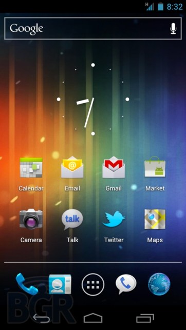
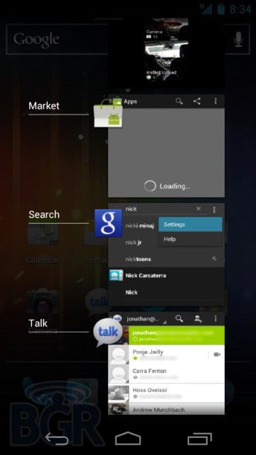
One of the immediately noticeable updates are the navigation buttons. No longer physical keys that sit beneath the display, these soft keys have been reduced from four to three, though two buttons disappeared. How is this possible? Gone are the search button and menu button, and what's left is the home button, back button, and and recent apps button. Android 3.0 Honeycomb users will be used to this layout for the most part, and the recent apps button is a dedicated app switcher that lets you easily bounce between your recent apps. It even shows you a visual preview of the last app you were looking at instead of giving you a list of eight icons that didn't tell you much.
Ice Cream Sandwich is a drastic departure from Android versions past, and every app, widget and graphic seems to have been redone to fit a single unified identity. Super smooth transitions and scrolling, multi-dimensional interface elements, and of course, heavy black and neon blue make up the Ice Cream Sandwich user interface. I love the new typeface, Roboto, on the Galaxy Nexus in most apps, though in some apps like email it appears bold for unread messages, and this contrasts with the delicate base font that I like so much.
While most of the OS is one piece, I do find it odd that something like a menu option isn't uniform across every app, including Google's own apps. For instance, the menu key (overflow button) is now contextual, but it sits in the top navigation bar at times, and at others it's buried at the bottom of an app.
The notification drawer has been refreshed to show thumbnails of different activities like the contact image of the person who is emailing you. It's a small change but it really gives you the feeling this isn't just another robotic OS from Google. It's something more. Instead of only having the option to clear all your notifications, you're now able to swipe away individual notifications, in addition to hitting an X at the top to clear all of them.
Android 4.0 is fast. Extremely fast. Scrolling between the five home screens (please, please let me customize the number of home screens) was silky smooth with practically no lag whatsoever. I love how the same animation when you get to the end of the home screens has carried over from Honeycomb, too. Google's search box is now not a widget but it's baked right into your home screens, and sitting on the opposite end of that search box is your collection of four customizable app icons and your apps drawer button. You can now also make app folders very easily, and while this feature existed previously in Android, it plays to the entire theme of Android 4.0 — we finally know what we're doing, and we're making something that's worth using.
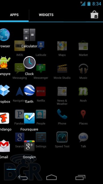
Bouncing into the app drawer, you'll find the insanely frustrating app library of Android 2.3 Gingerbread completely revamped to now appear as sliding horizontal panels that stack over each other. If you keep swiping, you'll get into the widgets section which is now seamlessly integrated into this one location.
A feature we exclusive reported on, in addition to full specifications of the Galaxy Nexus, of course, was that Android 4.0 will give users complete control over their data usage, at both the phone and app level. This includes going as far as blocking background data on specific apps, setting a warning level to let you know when you're approaching your monthly data plan limit, and also the option of completely disabling data when you get to that point. While some might think this relates to how much of a bandwidth hog Android is (it is), I'd look at this more as a feature that will let Android start to move into more emerging markets, in addition to possibly swaying some parents to upgrade their kids' phones to a smartphone from a feature phone. There should be a parental restriction option on data limits, though (through the whole phone, too), so you can set it to disable data when a cap has been reached.
Keyboard input has been dramatically improved. While I never got used to the default Android Gingerbread keyboard, Ice Cream Sandwich makes me love it. It seems as if the keys are the same size, or maybe just a tiny, tiny bit larger, but text input is a completely different world. I'd say it's almost, if not on par with iOS right now. Microsoft's Windows Phone keyboard still schools both OSes like a 3PM playground meetup, though. Voice input has also improved greatly, with words being recognized and displayed on the screen much faster than ever before.
I love Android's People app, a new take on how to look at and keep up with your contacts. It's very similar in concept to Window Phone's People hub in that you can see updates from your friends on their social networks like Twitter and of course, Google+. By tapping on a photo of your contact from anywhere in the OS (wherever there is an email address or notification from a friend, you'll see their thumbnail), a People view will pop up and give you access to their contact information in addition to social statuses. Facebook is the big glaring omission here, but we know that's not an omission, rather a strategic move on Google's end. There is a third party API here, however, so developers will be able to link into the experience.
While Android 4.0 feels like the most amazing OS release from Google yet in practically every way — speed, personality, cohesiveness and fluidity — it doesn't do much to make the experience less intimidating for potential customers, and that's sadly one of the reason's we're still going to have third party manufacturer skins on Android (obviously not the main reason). In fact, I'd say that Android 4.0 is actually more confusing at first than previous versions of the OS. I found myself diving through so many different menus, trying to remember where different options were, how to get to this app, how to remember to navigate the app drawer, where the menu key was in this app... you just find yourself under an avalanche of crap sometimes, and it's frustrating.
If I chose to use the Galaxy Nexus as my main phone for weeks, would I get used to it? Of course, and a big part of me really loves the amount of control you have in Android. From the home screen to apps, you can adjust your phone to the point where it almost seems like it was made just for you. I love having my calendar, Gmail, and Exchange widgets on the home screen. I love how I organize apps on the home screen, how my folders are constructed, and so on. But, I found myself jumping through so many panels, screens, pages, widgets and menus that I literally put the phone down and laughed. Add that to the very heavy Armin van Buren playground-like user interface, and it's almost overwhelming at times.
Browser
The entire browser has been redone for Android 4.0 and it shows. There's finally hardware acceleration that gives you much faster page loads, chrome bookmark sync, the ability to request the desktop version of a site. Although there's no Adobe Flash support at the moment, but that should be available before the end of the year.
Browsing various sites with the Galaxy Nexus was almost effortless as I zipped around the web hopping from one image and javascript heavy site to the next. Android is Google's OS play for the next generation of computing, not their Chrome OS, and you can start to see the pieces come together, especially in the browser. With support for up to 16 open tabs, this is starting to be positioned as a desktop-class browser that happens to be available on smartphones and tablets. Other little enhancements are the ability to save a page for offline reading (why does everyone want to hurt Marco Arment?) in addition to setting your homepage to your most visited sites.
I did notice some software glitches in the browser, mainly in how the OS handles animations into and out of the browser, and sometimes on first load of a webpage, but since this phone isn't running final software, I'll throw that into the probably-getting-fixed-before-release hat.
Camera
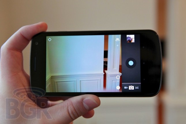
I usually don't review the cameras on many smartphones. Why? Because they are usually the same, terrible camera optics that I come across weekly on every phone that crosses my desk. Sure, they can take 8-megapixel photos and 1080p HD video, but the fact is that very few cameras are worth even talking about. The camera on the Samsung Galaxy Nexus does offer a few unique features, though.
First off, even though this is a 5-megapixel camera, it takes insanely fast photos with what Google and Samsung are calling zero shutter lag. As soon as you press the capture button, the photo is taken, assuming the photo is focused first. This is a great compromise between something like an EDoF lens that Nokia has used in the past which give you an instant photo, but no auto-focus, and a traditional camera sensor which can take quite a few seconds to snap the picture. In daily use, this worked very well and taking photos one after another was incredibly speedy and impressive.
The actual photos the phone takes are decent. With great lighting, especially outside with the sun out, photos are great. In decently-lit lighting environments, or low light situations, the camera is not so great. Add flash into the mix, and it's not really worth talking about.
Video performance was the same, with great lighting offering up awesome results and moderate or low light situations affecting both frame rate, quality, and noise. Google's real-time video effects are fun, though. They use face tracking to adjust different elements of your face, just like how Apple uses tracking to pull off these effects in Photo Booth. Apple stole the notifications drawer from Android, so it's only right Google stole something as important as face tracking with real-time image manipulation from Apple.
Gmail
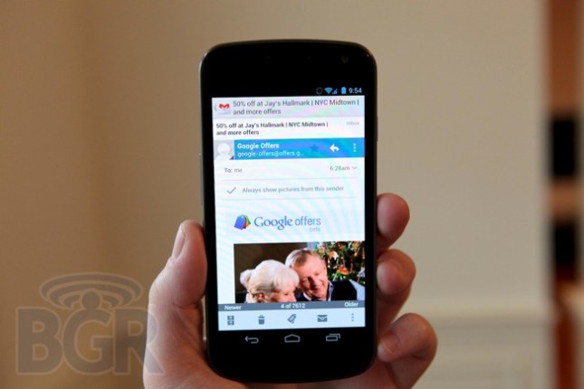
Another app that has received a complete overhaul is Gmail, giving you the best Gmail experience on the planet on a mobile device, and it looks better than it ever has before. It feels like Gmail was designed for this phone, and you finally have quick and responsive access to your email, in addition to managing your messages with labels and organization.
Google has introduced offline search as well, so you're able to search your email even if you're not connected to the network. Here is one of the apps where most commonly accessed options aren't hidden behind layers of menus; almost everything you need is present on one screen. You can delete messages, mark messages as read or unread, swipe back and forth through emails and more without leaving the regular app view. Unfortunately however, you still can't pinch to zoom.
Phone/Speakerphone
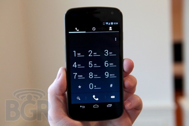
Voice calling on the Galaxy Nexus was decent. The actual phone performed well, with calls being generally clear most of the time, but occasionally the caller on the other end said I sounded very... robotic. Surely not an intended effect, right? Reception was on par with other top smartphones, though AT&T in midtown New York City at 4:47 p.m. is still AT&T in midtown New York City at 4:47 p.m. One issue I had with the phone is that the ear speaker has to be positioned just right for you to hear the call clearly. Just picking up the phone and putting it to my ear wasn't enough, but it's a minor annoyance that you'll most likely get used to.
The speakerphone on the Galaxy Nexus wasn't all that great. It didn't get nearly as loud as I needed it to on various occasions in different noise settings, and it distorted audio past a certain volume level. Playback for music and audio was more of the same, with volume, projection and distortion all a minor concern.
Battery
I have been using the Samsung Galaxy Nexus for around a week, and I have a very good feel for the battery life on the HSPA+ version of the phone. Standby time has been excellent, and with Gmail and Exchange accounts running Twitter in the background along with other background apps, the phone has lasted for days. Under heavy usage, like Google Navigation, the phone starts to show a little weakness, even with a 1,750 mAh battery.
Using the phone as my primary device and leaving the house with a full charge in the morning, I got a little more than halfway through the day before the phone started to warn me that the battery life was getting low after heavy emailing, browsing and using Google Navigation for around an hour. While the LTE version of the device will offer up an 1,850 mAh battery, LTE might take a toll, so we'll have to see if battery life is better or worse once I get an LTE version in my pocket.
Conclusion
This is almost comical at this point, but the Samsung Galaxy Nexus is my favorite Android device in the world. Easily replacing the HTC Rezound, the Motorola DROID RAZR, and Samsung Galaxy S II, the Galaxy Nexus champions in a brand new version of Android that pushes itself further than almost any other mobile OS in the industry.
While there were some hardware complaints, and even though Android 4.0 Ice Cream Sandwich isn't the most intuitive or user friendly operating system, it's absolutely one of the most powerful. Android 4.0 is coupled with the best smartphone Samsung has ever produced and easily leapfrogs any other competitor's device.
Unfortunately in the Android world, this hardly lasts a long time, and as we have started to see in various leaks, there's going to be some serious competition for the best Android smartphone in the world over the next few months. For now, though, this marriage of hardware and software, under Google and Samsung's direction, is an absolute winner.