Why Apple's Logo Has A Bite: Debunking The Most Famous Theory
Apple is arguably the most recognizable tech company in the world today. Known for its cutting-edge innovation, minimalist design that appeals across generations, and a reputation for high-quality products, Apple has grown far beyond its role as a hardware maker. In recent years, it has become a cultural icon with a devoted global fan base that treats every iPhone or MacBook product launch as a major event.
Sleek, simple, and instantly recognizable, Apple's logo became one of the most recognizable symbols in the world. Many people still don't know the meaning behind the logo or how it came to be, and there are lots of fun facts, myths, and speculation surrounding this image of a bitten apple. Was it inspired by the tragic fate of Alan Turing? Is it a reference to Isaac Newton? Or is it simply a well-executed piece of graphic design? Well it turns out the origins of the Apple logo are far simpler, so let's separate fact from fiction.
Speculation behind the 'Apple' namesake
Apple's very first logo originated in 1976, and it featured Isaac Newton sitting under an apple tree. This image is the company's nod to the anecdote Newton shared with his biographer: He was sitting under a tree when an apple fell, inspiring his thoughts on gravity. For generations, this anecdote was used to describe innovation, new ideas, and the "Aha!" moment. It's no wonder a company that's all about innovating technology would choose to depict this exact moment from a great scientist's life as its logo.
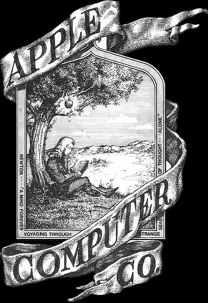
Some people even go so far as to believe that it was Isaac Newton who inspired the company's name, "Apple." However, Steve Jobs revealed to his biographer Walter Isaacson that he came up with the name while being on a fruitarian diet and visiting an apple orchard. At the moment, Apple was the most inspiring name he could come up with. It was later that his partner, Steve Wozniak, came up with the link to Isaac Newton and the falling apple, and decided to use it as a logo.
Another popular interpretation of Apple's logo is that it represents the biblical story of Adam and Eve. According to the tale, the first humans ate the forbidden fruit, often depicted as an apple, from the Tree of Knowledge. Some believe Steve Jobs intended to draw a connection between his company and this symbol of enlightenment. While the idea is intriguing, both Apple and the logo's designer, Rob Janoff, have denied this interpretation.
The Alan Turing connection
One of the most widely circulated myths about Apple's logo is that it's a tribute to Alan Turing, the father of modern computing science. Turing was a brilliant mathematician who helped crack Nazi communication codes during World War II. Many people believe his death inspired Apple's logo.
In 1952, Alan Turing was prosecuted for "gross indecency" due to his homosexuality, which was illegal in the UK at the time. Rather than serve a prison sentence, he agreed to undergo hormonal treatment intended to suppress his sexual orientation. In reality, the procedure amounted to chemical castration. Two years later, Turing died from cyanide poisoning, with a half-eaten apple found beside his bed. Whether his death was a deliberate act of suicide or a tragic accident remains uncertain to this day.
When the new Apple logo was revealed in 1977, it reminded people of Alan Turing's death. The new logo was a simple pictogram of an apple with a bite missing. As if to confirm the connection with Alan Turing, the new Apple logo was rainbow colored and resembled the Pride flag. But in reality, the rainbow stripes were there to indicate the launch of the new color display Macintosh. As for the Alan Turing connection, Apple's logo designer Rob Janoff admits it's one of his favorite stories. But it's just that, a story.
Reality check by the Apple logo's original designer
In a 2009 interview with CreativeBits, Janoff reflected on all the famous myths and speculations about Apple's logo he designed. He immediately dismissed the Isaac Newton and biblical interpretations, though he admitted that the Alan Turing story was his favorite. Still, as poetic as it may be, the Turing connection is just a myth. Janoff claims that at the time he created the Apple logo, he had never even heard of the brilliant mathematician who cracked the Nazi code.
More often than not, the truth is simple and rarely poetic. Janoff explained that neither Steve Jobs nor anyone else at the company gave him detailed direction about the branding they wanted. He had full creative freedom to design the logo, and following modern design trends, he opted for a clean, minimalist depiction of an apple.
But what about the missing bite? Janoff says he added the bite mark to ensure the logo was recognizable as an apple, not a cherry or another similarly shaped fruit. That small detail is what makes the logo unmistakably an apple. After completing the design, a colleague pointed out the pun between "byte," the unit of digital information, and "bite." Janoff hadn't intended the play on words, but he happily embraced it as a lucky coincidence.