iOS 26 Icons Look Blurry? Here's How To Fix It
It's not just you; you're not seeing things. Your vision hasn't worsened overnight, and your iPhone screen doesn't need cleaning. The hazy app icons were just one of the Liquid Glass issues that Apple needed to fix before iOS 26 launched. They look blurry, or somewhat blurrier than they did in iOS 18, because Apple made them look that way. It's the new Liquid Glass design language that Apple introduced this year across its products.
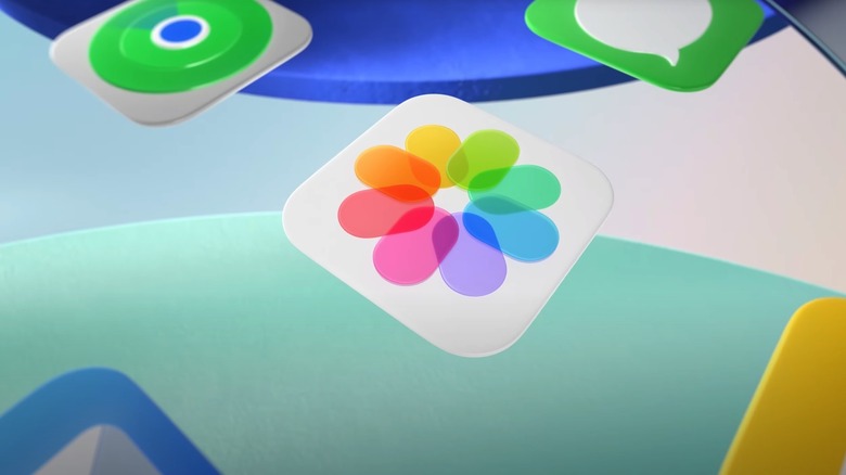
iOS 26, iPadOS 26, macOS 26, and watchOS 26 all received the same glassy look that visionOS introduced in 2024. The app icons and the menus are all transparent by design. Light passes through the various layers, refracting and reacting to how you move the device. That's why some app icons look blurry. They might have multiple elements, all made of virtual glass, and all of them handling light according to Apple's Liquid Glass principles. The more layers of glass, the blurrier the appearance of an icon. The Photos app icon (above) shows an example of overlapping glass elements that create blur.
If you haven't had the chance to try the various Liquid Glass versions that Apple tested during the iOS 26 beta phase, the iOS 26 update might initially shock you. It is one of the most discussed features that you'll have to learn about in iOS 26 once you update. It will take a while to get used to the new experience, including the blurry icons. The good news is that the final iOS 26 build that Apple released looks much better than the first version, app icons included. Also, there's a way to reduce the Liquid Glass transparency to improve the look of iOS 26 icons.
How to fix the blurry icons in iOS 26 and iPadOS 26
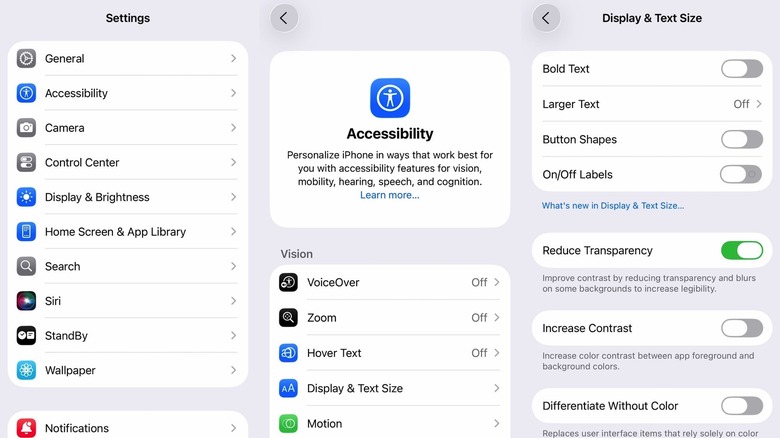
iPhone and iPad users who have updated to iOS 26 and iPadOS 26 can use a single setting that may improve the appearance of Liquid Glass on their devices. Apple doesn't let you turn off the glass transparency effect completely and revert to a design more similar to iOS 18. Instead, you get a Reduce Transparency menu that lets you tweak the transparency effect. Enable it, and Liquid Glass becomes more like frosted glass. Follow these steps to find the new menu:
- Go to the Settings app
- Tap Accessibility
- Tap Display & Text Size
- Tap on the Reduce Transparency toggle to enable it
This procedure might be enough to make Liquid Glass transparency more tolerable and improve the app icons. The same menu has a few other accessibility options you might consider, especially if you're having legibility issues in Liquid Glass. You can toggle on the Increase Contrast, Bold Text, and Button Shapes options (see screenshot above). You can mix and match these features until you find the perfect fit.
Finally, iOS 26 and iPadOS 26 introduce a new way to customize the app icon design and apply that customization uniformly. You can turn all the apps transparent or give them the same tint. This eliminates the various colors inside an app icon and reduces blur. Here's how to use the feature on the iPhone and iPad:
- Go to the home screen
- Tap anywhere on the wallpaper until the app icons start to jiggle
- Tap the Edit button in the top left corner
- Tap Customize
- Tap Clear or Tinted to set the app icon appearance.

