Your Windows 11 Start Menu May Look A Little Different Soon
Windows 11 launched in 2021, bringing updates to your PC that focused on new Microsoft features and a lot of Copilot AI through continuous upgrades. While Windows 11 has been criticized as being a broken mess, Microsoft is moving forward with updates to the Start menu. This new look and functionality began deploying to users in November 2025, so you may or may not have seen the update on your end yet as of this time of writing.
The new Start menu is larger, taking up more space on the screen. It makes room for a lot more apps, including ones you personally select and ones that Microsoft wants to push for you to use. It divides the Start menu into a Pinned section, which would be the apps you saved there, a Recommended section, which are ones Microsoft wants to draw your attention to, and an All section to scroll through every app. The Start menu now also has what's called Phone Link integration, letting you access a connected smartphone's contents from that space.
Are these changes actually any good? It depends on what you are looking for in a Start menu and who you speak to. Microsoft designed this to meet consumer needs and requests for an improved and more functional layout. However, some Windows 11 users feel the design and user interface are very poor.
What there is to like about the Start menu
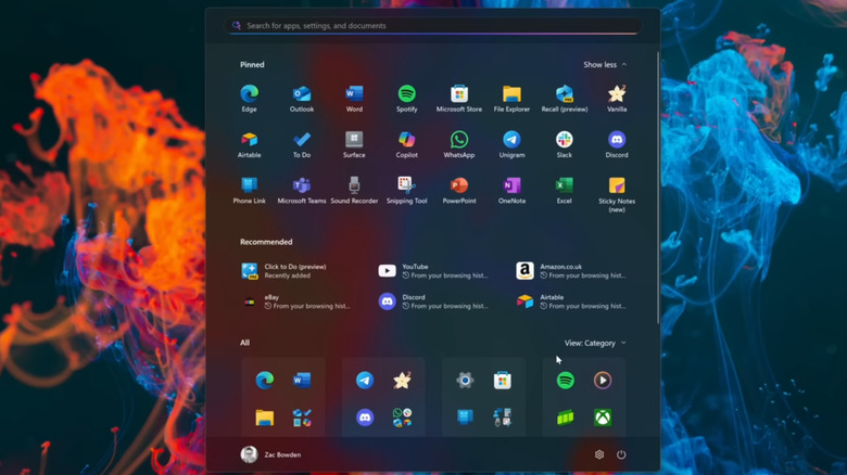
Microsoft has aimed at providing smarter suggestions for Windows 11 users through the Recommended section of the new Start menu. For those who want some ideas of apps and features they might be interested in but don't yet know about, will like this area. If you don't like it, it can be turned off, giving users a sense of customization the Start menu usually has. Microsoft also wanted to make it easier to find all computer apps in one place, which is where the All section comes in. You can simply scroll through to see every app.
The Start menu is much larger than before, so if you prefer bigger layouts then this is a positive change. The Phone Link is handy for those who like to use their smartphone capabilities in conjunction with their computer. With this new menu, the smartphone features will be in a sidebar off that menu for quick access. The Pinned app section continues to function as it always has, saving your preferred apps in one place.
You are also able to change the layout of the Start menu, at least a little bit. You can have apps grouped by Category, such as Productivity Tools or Developer Tools. Or you can have it organize the apps by name in a grid or list format. While playing with the new menu, there are also secret Windows 11 features you should check out.
What is wrong with the Start menu
Some users don't like how large the new Start menu is, taking up a lot of real estate on the screen. The size is not something that can be changed, taking away some customizability of the Start menu. The Recommended section has also come under fire for pushing content Microsoft wants you to use, not content you choose. Since the purpose of the menu is to quickly access your preferred apps, having what amounts to a type of advertisement section takes away from that value.
While the Recommended section can be turned off, Microsoft seems to want to purposefully make it hard by forcing you to turn off other features in conjunction with it, such as browsing history and recent apps. With Windows 11, there are some settings you should change. It seems the lack of personalization of this menu is where Microsoft may have gotten the views of its user base incorrect.
General complaints by users when encountering the new Start menu are that they want it to be simpler and straightforward, not so big and so full of content that it must be scrolled through. Many preferred the look and feel of the Windows 7 Start menu, believing this is a move in the wrong direction. One post about the new menu on X had a user commenting, "Windows is like a grocery store that keeps moving items that you like to different aisles so you have to search for them."