

What Does Each Google Maps Traffic Color Mean?
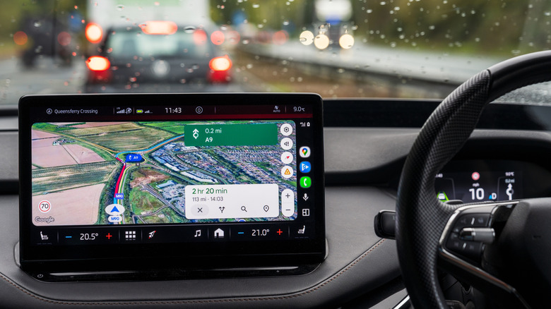
Although it can be plagued by a handful of common issues, Google Maps is an incredibly useful navigation app for getting you directions and route guidance. Over the years, a number of iterations have improved the user interface and approachability, and Google Maps has also seen a number of great new features added just this year, including traffic intelligence and predictive routing. There are a bunch of hidden Google Maps features that can make your trips better, but one of the clearest features is the rainbow of colors the app uses to indicate traffic density.
On top of the handful of visual indicators to let users easily see if the map contains is a surface road, highway, underground tunnel, or railway, Google Maps also uses specific colors to show drivers if there is traffic along their desired destination. This high-contrast palette of colors that quickly indicates exactly how much of a delay drivers can expect, and offers alternative routes, when possible, to circumvent the traffic congestion.
The basic color code
With traffic data turned off or no traffic data available for that area, all roads and highways (including underground tunnels, which add diagonal lines) are represented by gray lines. Generally speaking, surface roads and side streets are shown in a lighter gray, while major roads, highways, and interstates are a darker gray. Railways are also light gray, but they are depicted as a pair of thinner lines with perpendicular dashes to closely resemble an actual train track.
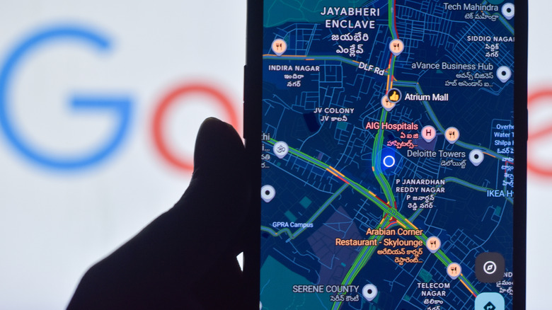
To turn on traffic data, click the Layers button on the Google Maps screen, and then select Traffic. When available, this will display traffic density using a variety of colors:
- Green: The best-case scenario. Green tells you traffic is moving smoothly and you should expect little to no delay along that stretch of road.
- Yellow/orange: This indicates that while cars are still moving, speeds are slower than normal, and you may hit brief delays or stop-and-go patches. Yellow indicates lighter traffic, while orange shows heavier congestion.
- Red: This is a stronger warning. It indicates heavy traffic and slower travel times, often caused by congestion, construction, or incidents on the road. This is where shade is most important. A standard red segment usually points to stop-and-go traffic, while darker red suggests more severe delays and the possibility of stopped traffic.
- Blue: This isn't a traffic indicator, but rather an indication of route guidance. Dark blue is used for the preferred or selected route, while a lighter blue is used for suggested route alternatives.