

What Do Purple Icons Mean On Google Maps?
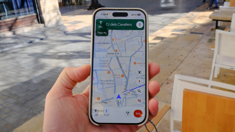
In 2017, Google Maps introduced a color scheme to its location icons as a way to let users know at a glance where to find food, gas, or things to do. But Google Maps periodically adds new features, including updated color schemes, which may have you seeing red when looking at some of these icons. As for the purple icons, these mark attractions ranging from cinemas, museums, and amusement parks to monuments, historical sites, and photo opportunities.
Major attractions like The Statue of Liberty get their own special pictograms, but otherwise, you'll find the 9/11 Memorial & Museum as well as the Holland Tunnel ventilation shafts denoted with purple pins. Pink icons are for hotels, orange pins denote food and drink locations, while the green ones typically represent natural attractions like parks, mountains, forests, and beaches. Government facilities, places of religion, and private residential complexes are marked by gray pins, with red icons indicating health and emergency services such as hospitals, pharmacies, and firehouses.
The many blue Google Maps icons
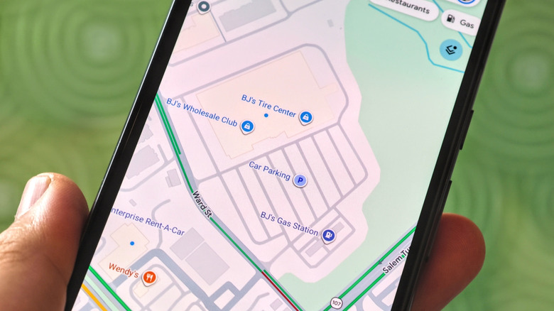
You could quibble with how Google Maps has categorized points of interest, but the biggest bone we have to pick here is how designers have used the color blue. There's a cornflower blue shade used on pins for what Google calls "services:" banks and ATMs, gas stations, and auto rental lots. Parking facilities feature a lighter shade of this cornflower blue. Then we get to icons of a truer blue hue, if you will, which indicate a broad range retailers from supermarkets and big box chains to car dealers and carpet sellers.
And while airport terminals feature dark gray pins with a pictograph of a plane, the actual airport has yet another shade of darker blue icon. In a wider map view context or with aerial Street View exploration, these icon colors might not matter as much. But there are cases, such as browsing with a satellite overlay, where having similar shades of blue represent a vast variety of locations does not provide a user-friendly experience. It's already difficult to describe these colors, much less pick out their differences if we're quickly using our Android Auto head unit at a red light, not to mention for those with colorblindness.