

Some Of Your Most Important Google App Icons Are About To Look Different
Your Android home screen is getting a fresh coat of paint. Google just announced that it's officially rolling out redesigned icons for three of its most commonly used communication apps: Phone, Messages, and Contacts. The rollout began hitting devices on November 2, 2026, so expect to see this fresh-looking update land on your phone soon.
And there's no need to panic: none of the functionality of any of these apps is changing. While Google has made other changes to Android in 2026, it isn't adding in any secret new features or pushing a radically new interface. It's purely an aesthetic upgrade that's aimed at making the icons look a little more modern, and Google seems to have knocked it out of the park here. It knows these are the apps you use all day every day, and that even minor tweaks can catch your eye and potentially annoy you. But the refreshed icons offer a nod to their previous iterations while now looking fresh.
The general shape and vibe of the icons are sticking around; you'll still see the familiar phone receiver, speech bubble, and contact silhouette. It's simply a subtle facelift that helps these icons match the others Google has updated recently.
Gradients, curves, and aesthetics — oh my!
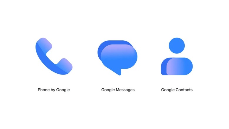
So what specifically is changing? Google sums it up well, stating the update "added a subtle but crisp gradient with easily readable edges. They also feature updated curvature and coloring to align with the rest of the Google apps you know and love." Google's goal here seems to be better brand cohesion. The company wants its sprawling arsenal of software to match the aesthetic of its iconic "G" logo, and this update officially brings Phone, Messages, and Contacts into that updated visual family.
This refresh is just the latest in a series of ongoing, and often questionable, updates. Earlier this year, Google announced a sweeping redesign of its Workspace icons, finally addressing the years of user complaints. Back in 2020, the company rolled out a controversial design style that forced nearly every Google app into the exact same four-color geometric style. As you can imagine, navigating the apps was confusing, as that design made them all look alike.
To redeem this faux pas, and hopefully sway people from using third-party Android icon packs, this year's redesign has ditched the widely hated four-color style for smoother shapes and more singular, gradient colors — and the updates for Phone, Messages, and Contacts follow that playbook exactly. These app icons don't just look more modern now, they look cohesive with other Google app icons, yet still distinct. The refresh looks good on you, Google.